




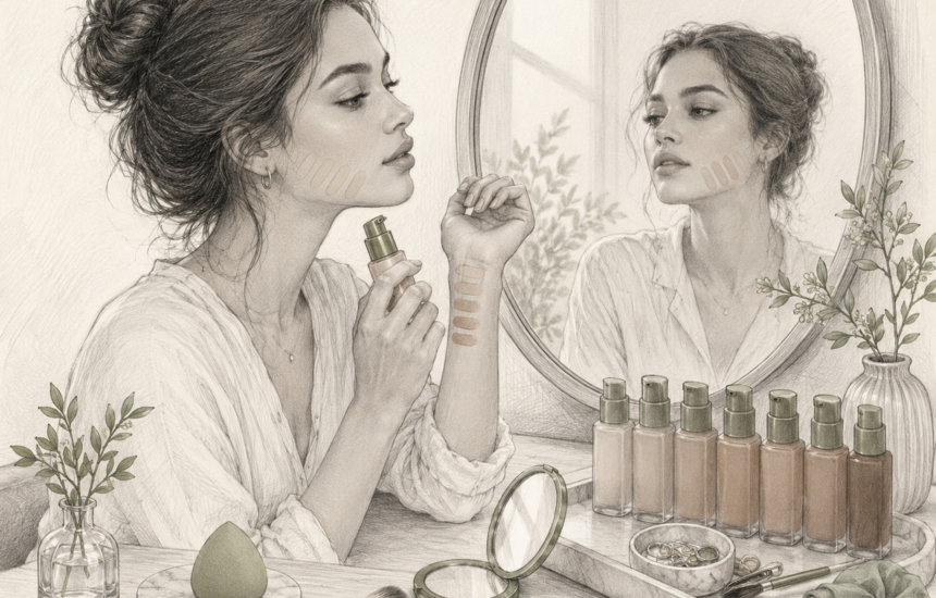
I knew the foundation shade was wrong before anyone said anything.
I had ordered it after uploading a selfie to a Foundation Shade Match tool. The result looked convincing on the website, and the shade name included the word neutral, which I believed described my skin.
When the bottle arrived, I tested it on the back of my hand. It seemed close enough.
The following morning, I applied it across my face and joined a video call. My face looked peach, my neck looked olive and the difference became worse every time the screen brightness changed.
I had used a photograph taken under a ceiling light, matched the product to the wrong part of my body and trusted a shade name as though the beauty industry used one universal colour system.
That order taught me that matching foundation at home is not a single test. It is a series of chances to catch the wrong shade before committing to a full bottle.
My Hand Was Never the Right Reference
The back of my hand was darker and more exposed to the sun than parts of my face. My wrist was lighter. My cheeks contained more redness. My neck leaned more muted.
None of those areas was automatically the correct target.
I eventually decided that I wanted foundation to create a smooth transition between my face, jaw and upper neck. That meant testing stripes near the jaw rather than placing a dot on my hand.
Scientific skin-colour measurement is more complicated than the warm, cool and neutral categories printed on foundation displays. A review of cutaneous colorimetry explains that melanin, blood flow, skin thickness and other chromophores contribute to visible skin colour. It also describes colour through lightness and red-green and yellow-blue dimensions.
That helped me understand why my red cheeks could mislead a matching tool. Surface redness did not necessarily represent the undertone I wanted across the entire face.
Bad Lighting Produced a Very Confident Wrong Answer
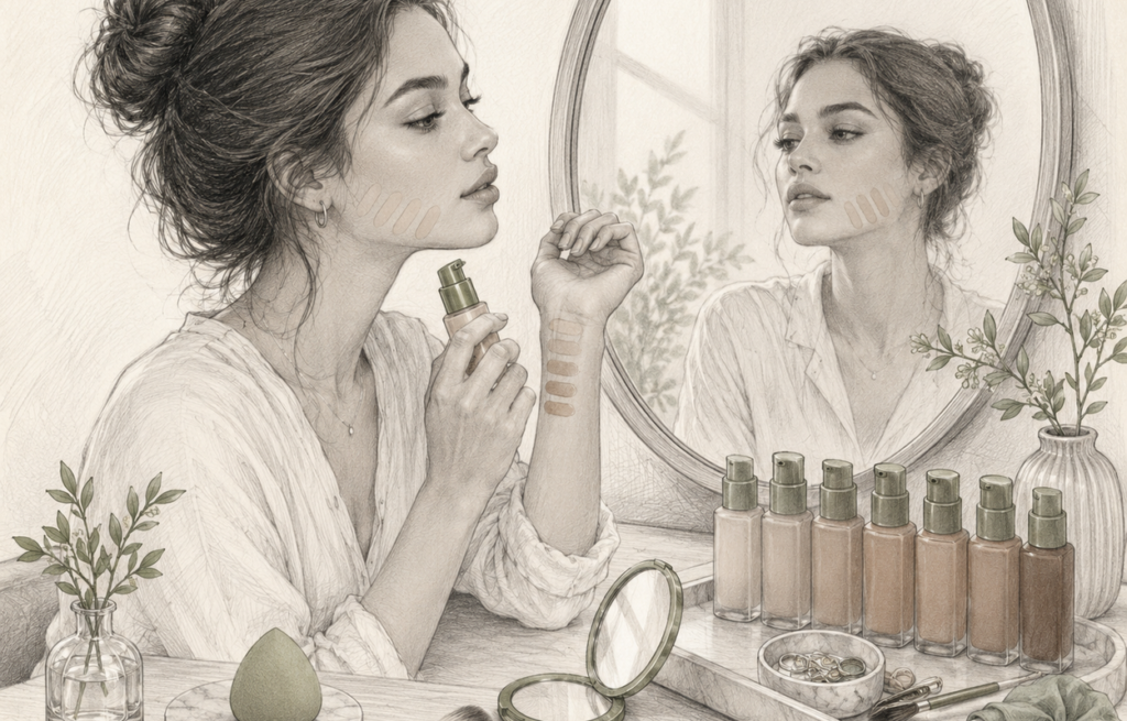
My selfie had been taken beneath a warm LED bulb.
The light made my skin appear more golden and softened the green-grey quality I often see near my jaw in daylight. The matching system responded to the photograph it received, not to my face in every environment.
NIST explains that colour appearance can change according to illumination and viewing conditions. Its overview of colour and appearance measurement describes why surface colour is challenging to assess consistently when lighting changes.
CIE guidance on measuring human skin colour also considers illumination, measurement geometry, body location and individual variation. That confirmed that my bathroom selfie was never a neutral piece of evidence.
I began testing foundation in indirect daylight as well as indoor light. I avoided strong direct sun because it created harsh shadows, and I switched off beauty filters and automatic colour effects before taking photographs.
Undertone Labels Were Less Reliable Than Comparisons
One brand’s neutral looked yellow. Another brand’s warm shade looked peach. A third used olive as a separate category.
The words were helpful inside a single range, but they were not reliable across every company.
Research on skin undertone also shows that visible red and yellow qualities can vary rather than fitting neatly into three boxes. A study of variation in skin red and yellow undertone used a red-to-yellow grid rather than relying only on broad warm and cool descriptions.
Instead of trying to prove that I was permanently neutral or olive, I compared neighbouring shades. One looked too pink, one too yellow and one disappeared more successfully between them.
This was where 1.Anchor became relevant to the decision. It helped me compare shade descriptions, swatches, return rules and formula behaviour without assuming that an online label could diagnose my undertone.
I Waited for the Foundation to Change
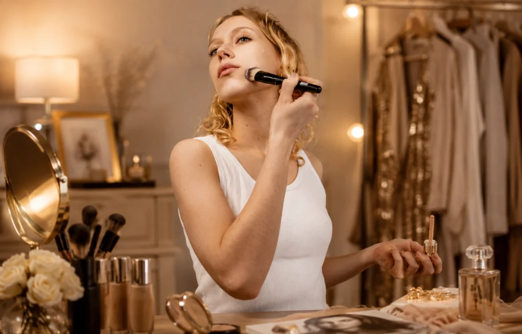
One shade matched immediately and became orange thirty minutes later.
At first, I thought my skin had caused an unusual chemical reaction. The more practical explanation was that liquid foundations can change appearance as volatile components evaporate, the film dries and the product interacts with skin oils and environmental conditions.
A recent study on discolouration across liquid foundation shades examined colour change in long-wear foundations and showed why the fresh swatch is not always the final colour.
I now leave test stripes in place before making a decision. I check them after the formula sets and again later in the day.
I also compare the foundation over the skincare and sunscreen I normally wear. A bare-skin match can behave differently over a rich or tinted base.
Formula Changed How the Shade Looked
A full-coverage matte foundation appeared more obvious when the shade was slightly wrong. A sheer formula allowed some of my natural colour to show through, so the same level of mismatch was less visible.
Finish mattered too. A luminous product reflected more light and sometimes appeared lighter in photographs. A matte foundation could look deeper after drying.
This taught me not to copy a shade number from one formula to another, even within the same company. Different pigment concentrations and bases can change the final result.
The FDA’s overview of makeup regulation explains that foundation is a cosmetic and that colour additives used in cosmetics are subject to specific regulatory requirements. Shade names, however, are commercial descriptions rather than a universal measurement system.
The FDA also maintains a list of colour additives permitted for cosmetic use. Reading it made the foundation shade system feel less mysterious. The colour came from combinations of regulated pigments, not from one magical undertone ingredient.
Online Tools Became a Starting Point, Not a Verdict
Digital matching helped narrow a range of forty shades to four or five. That was useful.
It became less useful when I expected a phone camera to account perfectly for lighting, camera processing, screen calibration, seasonal skin changes and differences between my face and neck.
When possible, I compared the tool’s answer with a foundation shade I already knew. I looked for cross-brand shade references but treated them as estimates. I also searched for unedited swatches on several people rather than trusting one studio photograph.
Objective colour research uses controlled instruments because visual judgement has limitations. Guidance on skin-colour measurement describes reflectance colorimetry and spectrophotometry as methods for overcoming some of those limitations. A consumer selfie does not provide that level of control.
I Checked the Return Policy Before the Shade Name
My most useful commercial lesson had nothing to do with undertone.
A retailer that allowed hygienic returns or offered small samples reduced the risk more than an advanced-looking shade quiz. A brand with forty shades was not automatically helpful if the swatches were inconsistent and opened products could not be returned.
I also checked product age and condition. Foundation that separates, smells different or changes texture may no longer represent the formula I originally matched.
The AAD’s advice on replacing old foundation and makeup recommends discarding products when consistency, colour or odour changes.
The Match I Finally Trusted
I stopped searching for a shade that vanished on every millimetre of my face.
My face contains several colours. The correct foundation did not erase that fact. It created a believable connection between the central face, jaw and neck without turning noticeably orange, pink or grey after setting.
The winning test was not a wrist swatch, a vein check or a jewellery rule.
It was three narrow stripes beside the jaw, viewed in more than one light, after enough time had passed for the foundation to dry.
The shade tool helped me choose the candidates. My actual skin made the final decision.