




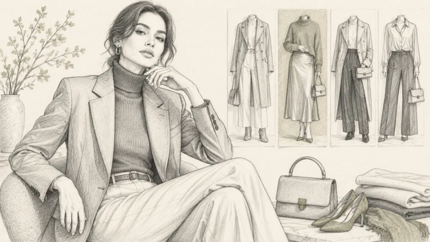
My first attempt at wearing chili red lasted fourteen minutes.
Chili Red the 2026 color Of The Year is all about using a strong, warm red as a confident accent rather than letting it overwhelm your outfit. You can start small with shoes, a bag, or knitwear, or make the shade the main focus with a dress, jacket, or matching set balanced by simple neutrals.
I had ordered a bright red satin blouse after seeing the colour repeatedly online. The product photograph showed a deep, expensive-looking red. In my bedroom, it looked closer to a warning light.
I paired it with red lipstick, black trousers and pointed shoes because I thought a strong colour required an equally strong outfit.
When I looked in the hallway mirror, the blouse entered the room before I did.
I changed into navy and left the red shirt hanging over a chair.
The mistake was not choosing a bold colour. It was believing that wearing a trend successfully meant turning its volume all the way up.
Chili Red Is Not One Universal Color of the Year
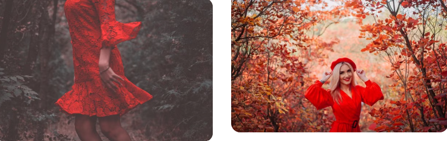
The title needs an important distinction.
Chili Red was named Stitch Fix’s 2026 Color of the Year. The company described it as a confident shade linked with its “Statement Staples” forecast and reported growing interest in red pieces among its clients. It is a retailer and styling service’s designation, not one universal decision made by the entire fashion industry. The official Stitch Fix announcement explains the basis of the selection.
That difference matters because colour forecasts come from several organisations, retailers and runway analysts. They do not always choose the same shade.
Pantone publishes separate fashion colour trend reports, while designers may produce several important colours during the same season.
Treating Chili Red as one strong 2026 colour story is more accurate than treating it as an official global rule.
Red Worked Better When I Treated It Like Navy
My second mistake was saving red for dramatic outfits.
That made every red purchase feel like an event. I did not know how to wear the colour on an ordinary weekday, so the pieces remained unused.
A recent Vogue discussion of wearing red as a neutral argued that red can function as a wardrobe base rather than only as an accent. Current runway and street-style examples have paired it with colours beyond predictable black and white.
I tested that idea with clothes I already trusted.
A chili-red knit worked with dark denim. A red bag lifted an olive jacket. Red flats made grey trousers feel less formal. None of the outfits required matching lipstick or another red item.
The colour became easier when I stopped introducing it as the most important object in the room.
I Had Chosen the Wrong Red for the Wrong Fabric
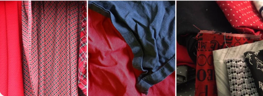
The colour looked deeper in the product image because of lighting and fabric movement.
On my blouse, the shiny surface reflected every light source. The red appeared brighter across the shoulders and darker in the folds. It was not one stable block of colour.
Vogue’s coverage of spring 2026 runway colours identified vivid tomato and chili-like red tones among the season’s notable shades. The examples also showed how texture changes the character of a colour. Red tweed, satin, leather and cotton do not communicate the same message.
I had concentrated on finding the correct shade name while ignoring the material carrying it.
When I tried chili red again, I chose a matte knit. The colour looked calmer because it was not throwing light back at me.
I Needed to Know My Comfortable Amount
Some people feel natural in a red coat. I became self-conscious.
That did not mean red was unsuitable for me. It meant I needed less surface area.
A narrow belt, small shoulder bag, scarf or shoe gave me the energy of the colour without making me feel dressed as a trend. Later, after becoming used to it, I added a knit and a simple dress.
The V&A’s introduction to 1960s fashion shows how colour became tied to youth, new identities and changing social attitudes. Bright colour has long carried more than visual value. It can suggest confidence, rebellion or optimism depending on the setting.
My own comfort mattered because colour affects posture. When I felt watched, I adjusted the garment and withdrew. When the amount felt right, I forgot about it.
The Rest of the Outfit Needed Less Explanation
My failed blouse competed with pointed shoes, strong lipstick and shiny jewellery.
Each item was attractive alone. Together, they looked planned too carefully.
I learned to allow chili red to provide the shape of the outfit. With a red top, I preferred simple trousers and familiar shoes. With a red bag, I could wear an otherwise quiet outfit.
The V&A’s account of Art Deco fashion and jewellery shows how vivid colour, geometry and decorative objects were balanced within complete looks. It reminded me that statement colour does not need to remove structure or restraint.
This was where 1.Anchor became relevant. I stopped comparing red pieces only by colour intensity and began comparing fabric, cut, care requirements and how easily each item worked with the clothes I already owned.
A Red Purchase Needed to Last Beyond 2026
A trend colour can create urgency. The product appears current, and the shopper imagines the moment disappearing.
I began asking whether I had liked similar reds before the trend received a name. I also checked whether I would still wear the item if brown, blue or green became more prominent the following year.
WRAP’s 2026 report on durability as a fashion advantage argues that long-lasting clothing depends on material choice, construction and consumer use. A fashionable colour does not compensate for poor seams, unstable fabric or a garment that loses shape quickly.
Care also mattered. Red dyes can behave differently across fabrics, and an item that needs inconvenient care may not receive regular wear.
The FTC’s care-labelling guidance explains that garments should carry regular cleaning instructions and necessary warnings. I now read those instructions before buying a vivid item rather than after the first wash.
The Shirt Eventually Worked
I did not return the satin blouse.
Months later, I wore it open over a white vest with relaxed jeans and plain loafers. The casual layers reduced the intensity, and the red finally looked connected to my real wardrobe.
It had never needed red lipstick, a formal shoe or an occasion.
Chili red worked when I stopped trying to prove I knew it was fashionable.